
Top rocker, movie vest controversey.
-
WarlordSwan

- Rank: Turnbull AC
- Posts: 116
- Joined: Thu Aug 17, 2006 10:14 pm
Top rocker, movie vest controversey.
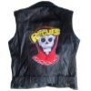
Well, I've heard from some people saying that the Warriorcleon patch is off in that the letters touch, which is probably the only thing that is in-correct about them, I can dig that.. but, the thing about the right corner being a little longer then the left, I believe, is totally accurate...kind of like a banner would look. Check out this back shot of Ajax and you can clearly see that the right corner is longer then the left corner.  Thoughts?
Last edited by WarlordSwan on Mon Nov 06, 2006 3:07 pm, edited 1 time in total.
Jants
http://www.msnusers.com/CostumeFreak/shoebox.msnw
http://com5.runboard.com/brubberhoodofthebat
http://www.msnusers.com/CostumeFreak/shoebox.msnw
http://com5.runboard.com/brubberhoodofthebat
-
alexfugazi
- Rank: Warrior
- Posts: 287
- Joined: Thu Jun 08, 2006 10:43 pm
- Location: Austin Tx
- Contact:
Re: Top rocker, movie vest controversey.
Well dang. Now- do we consider that a flaw in the original costume department's work, or was that intentional? I'm pushing for a more 'even' style patch, even if it isn't just like the film...
-
WarlordSwan
- Rank: Turnbull AC
- Posts: 116
- Joined: Thu Aug 17, 2006 10:14 pm
Re: Top rocker, movie vest controversey.
I don't think it's a flaw, persay. Most artists, when drawing up a flag, will make one of the corners longer. It's an artistic thing, in that if you picture the left side having a pole attached to it (like a flag would), the right side would then in fact not be attached to anything and hanging loosely, hence being a little longer in the corner area then the other side. 8)
Jants
http://www.msnusers.com/CostumeFreak/shoebox.msnw
http://com5.runboard.com/brubberhoodofthebat
http://www.msnusers.com/CostumeFreak/shoebox.msnw
http://com5.runboard.com/brubberhoodofthebat
-
Ninth Delegate
- Rank: Warrior
- Posts: 2660
- Joined: Fri Mar 24, 2006 1:12 pm
- Location: Nottinghamshire
Re: Top rocker, movie vest controversey.
Ive had a look at various scenes in the film; swan in the tunnel, ajax on park bench and on the train immediatly after escape from turnbulls. That bottem right corner does appear to droop slightly more than the left. You have to look hard before you notice it.
Is it a flaw? I would say yes. If youve ever tried drawing the warriors rocker freehand, it never comes out 100% equal. Thats what i think may have happened. Just my 2 cents.
Warlordswan; i dont disagree with your flag pole theory. Just remember that the top rocker isnt a flag, its copied from contempory motorcycle clubs, so it should be even. thats why i think its a flaw.
Good call tho, and well spotted. =D>
[IMG]http://i85.photobucket.com/albums/k70/shaunographic/warriorssig.jpg[/IMG]
Laziness is a skill that must be practiced everyday.
Laziness is a skill that must be practiced everyday.
-
WarlordSwan
- Rank: Turnbull AC
- Posts: 116
- Joined: Thu Aug 17, 2006 10:14 pm
Re: Top rocker, movie vest controversey.
Thanks man. I've been told I have an eye for spotting little things... been told I'm way too anal, hehehe.. On this one, I still really doubt it's a flaw. They got the Warbird wings identicle to one another as well as other parts of the Warbird, diamond trim, pockets etc.. and it is doubtful that they would have an artist who did the preliminary sketch, before it went into stitching, would do it free-hand. One quick way to make sure both sides are perfect is, you fold the paper you are drawing the outline on, in half, draw the left side, flip it over and trace what you drew on the other side and there you'll have a 100% perfect outline to work with. That is just one method of doing it, there are others. I really think, going by the whole 70's theme and the fact that there is a real sports team in Coney Island named, The Coney Island Warriors, they went with the banner look, as opposed to just Warriors patch. It's a real minor thing and either way looks great (looking at Charlloots Rocker you can see that looks great too), but I've heard how the WC patches are off in that regards and this photos of Ajax has been calling me to post it here, LOL! I honestely wanted to post this thread weeks ago, but was so busy with Halloween costume orders, I never got around to it. :mrgreen:
The funny thing is, being a costume maker and making some pretty intricate stuff, I still trip out on the subtle complications involved with such a simple looking vest. :shock: But from the looks of things, we're all heading in the right direction...and I'm looking forward to taking a crack at it myself.
The funny thing is, being a costume maker and making some pretty intricate stuff, I still trip out on the subtle complications involved with such a simple looking vest. :shock: But from the looks of things, we're all heading in the right direction...and I'm looking forward to taking a crack at it myself.
Last edited by WarlordSwan on Wed Nov 08, 2006 9:18 am, edited 1 time in total.
Jants
http://www.msnusers.com/CostumeFreak/shoebox.msnw
http://com5.runboard.com/brubberhoodofthebat
http://www.msnusers.com/CostumeFreak/shoebox.msnw
http://com5.runboard.com/brubberhoodofthebat
-
charlloots
- Rank: Rogue
- Posts: 179
- Joined: Sat Jun 24, 2006 2:50 pm
- Location: CONEY ISLAND
- Contact:
Re: Top rocker, movie vest controversey.
my opinion on this is the angle of the picture.
if you draw a line from the left bottom point
of the rocker to the right side bottom point.
the line will cross the same wing tips on both
sides of the warbird.
here is a piture of one of my vests from the other
angle. it seems the left side is now dropping.
http://www.webspawner.com/users/charlloots/index.html
- Attachments
-
-
Last edited by charlloots on Thu Nov 16, 2006 12:03 pm, edited 1 time in total.
-
charlloots
- Rank: Rogue
- Posts: 179
- Joined: Sat Jun 24, 2006 2:50 pm
- Location: CONEY ISLAND
- Contact:
Re: Top rocker, movie vest controversey.
well heres a picture with a straight line.its clear there is no droop.
my opinion is its just an illusiuon,
http://www.webspawner.com/users/charlloots/index.html
my opinion is its just an illusiuon,
http://www.webspawner.com/users/charlloots/index.html
- Attachments
-
Last edited by charlloots on Thu Nov 16, 2006 12:04 pm, edited 1 time in total.
-
WarlordSwan
- Rank: Turnbull AC
- Posts: 116
- Joined: Thu Aug 17, 2006 10:14 pm
Re: Top rocker, movie vest controversey.
I took that into consideration aswell, but if you look at the top of the banner (almost above the "drooping part") you can see that the flag goes higher past the middle area, like the WarriorCleon patches, so the bottom corners line up when drawing a line, because of how the banner is positioned. Looking at your pics, I can definetely see how that second angle can give the illusion of being slightly longer, but look at how much white there is from the W to the left corner, then look at how much white is showing from the S to the right corner. Considering that WC had a graphic artist draw up these patches, off of the screen used ones, I think they are correct.. minus of coarse the letters touching, which to me was probably something he did on purpose because it does look better when the letters touch...gives it a flowing feel, instead of a choppy feel.. but I personally like both and would prefer the letters not touching, for accuracy sakes. 
Jants
http://www.msnusers.com/CostumeFreak/shoebox.msnw
http://com5.runboard.com/brubberhoodofthebat
http://www.msnusers.com/CostumeFreak/shoebox.msnw
http://com5.runboard.com/brubberhoodofthebat
-
charlloots
- Rank: Rogue
- Posts: 179
- Joined: Sat Jun 24, 2006 2:50 pm
- Location: CONEY ISLAND
- Contact:
Re: Top rocker, movie vest controversey.
well then im gonna have to say its the placement of the letteres
that your talking about.the w is touching the red border the s
is not.
i dont believe the film used rocker is drooping at all.
also take in to consideration the shape of the w compared
to the letter s.
here is another picture with the same illusion.
that your talking about.the w is touching the red border the s
is not.
i dont believe the film used rocker is drooping at all.
also take in to consideration the shape of the w compared
to the letter s.
here is another picture with the same illusion.
- Attachments
-
Last edited by charlloots on Wed Nov 08, 2006 7:03 pm, edited 1 time in total.
-
The Warriors 9

- Rank: Warrior
- Posts: 478
- Joined: Sat Oct 01, 2005 2:26 pm
- Location: USSA
Re: Top rocker, movie vest controversey.
WarlordSwan wrote:
The funny thing is, being a costume maker and making some pretty intricate stuff, I still trip out on the subtle complications involved with such a simple looking vest. :shock: But from the looks of things, we're all heading in the right direction...and I'm looking forward to taking a crack at it myself.
Loving the effort and thought you guys are putting out on this. Gonna hold out for a while myself, watch this and may the best man win.
Worlds 2nd biggest Orphans Fan.